MDX Component Reference
Every custom component available in this template — with live examples, props, and copy-paste snippets.
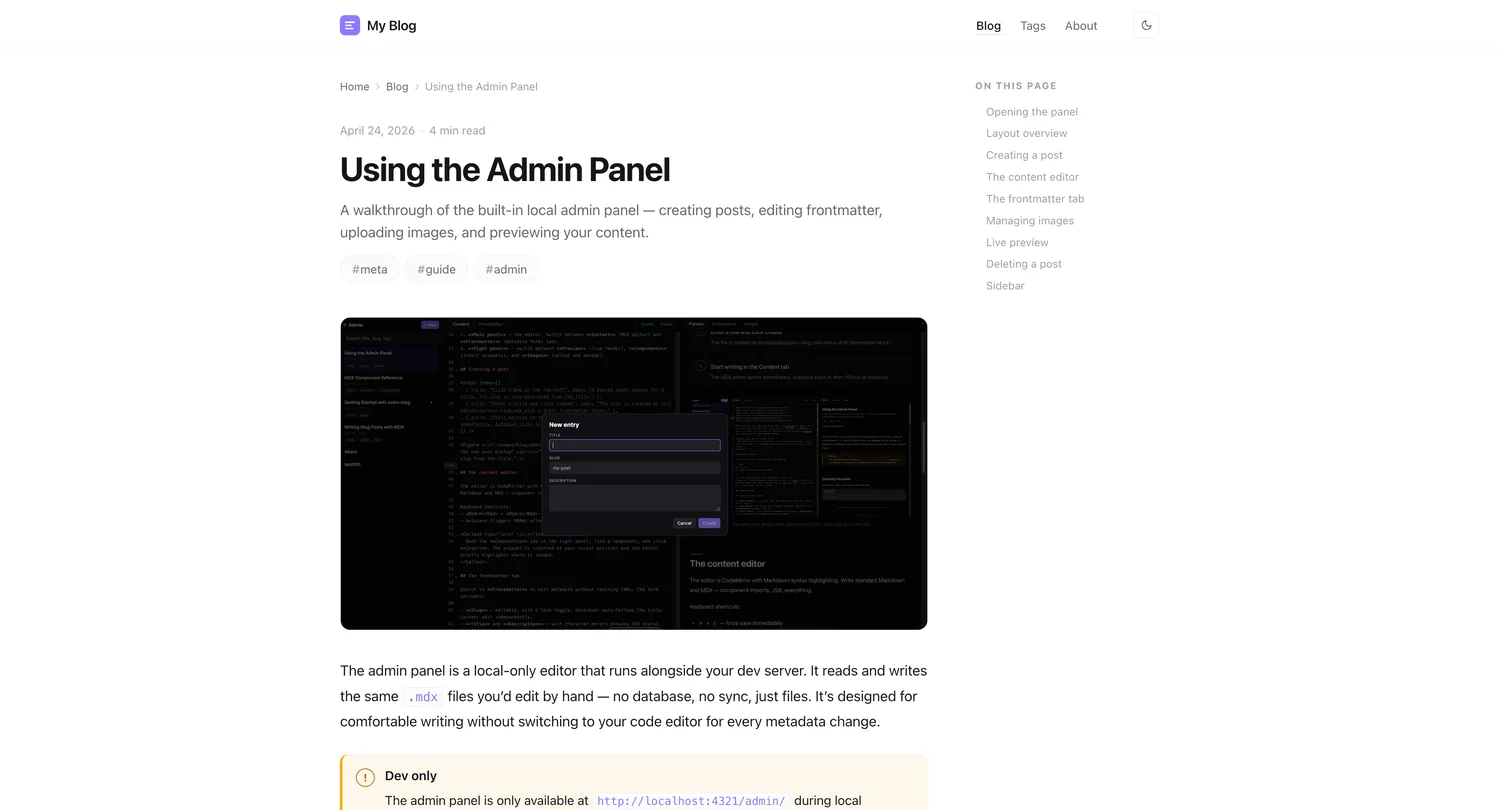
Table of contents
This is your component reference. Each section shows the import, props, and a live example. Keep this post as a reference or delete it once you’re familiar with the components.
Tip
In the admin panel, open the Components tab on the right to browse and insert snippets without copying from this page.
Callout
Highlighted boxes for important information. Four severity levels.
import Callout from "@/components/blog/Callout.astro";
<Callout type="info" title="Heads up"> Your message here.</Callout>| Prop | Type | Default | Notes |
|---|---|---|---|
type | info | warn | success | danger | info | Controls colour |
title | string | — | Optional bold heading inside the box |
Info
Use info for neutral notes, tips, and supplementary context.
Warning
Use warn for non-blocking cautions — something worth noticing before proceeding.
Success
Use success for confirmations, “you’re done” moments, or positive results.
Danger
Use danger for destructive actions or errors that will break things.
Steps
Numbered step list for tutorials and how-tos.
import Steps from "@/components/blog/Steps.astro";
<Steps items={[ { title: "First step", body: "What to do." }, { title: "Second step", body: "What to do next." },]} />| Prop | Type | Notes |
|---|---|---|
items | { title: string; body?: string }[] | Each item renders as a numbered card |
- 1
Install dependencies
Run bun install in the project root.
- 2
Configure the site
Edit src/site.config.ts with your identity and settings.
- 3
Deploy
Push to GitHub and import on Vercel — detected automatically.
Figure
Image with optional caption and border. Preferred over raw ![]() syntax.
import Figure from "@/components/blog/Figure.astro";
<Figure src="/images/blog/my-post/screenshot.webp" alt="Descriptive alt text" caption="Optional caption below the image."/>FileTree
Visual directory tree for showing folder structures.
import FileTree from "@/components/blog/FileTree.astro";
<FileTree items={[ { label: "src", children: [ { label: "pages", children: [{ label: "index.astro" }] }, { label: "site.config.ts", note: "← edit this" }, ]},]} />- src/
- data/
- blog/
- getting-started.mdx
- writing-posts.mdx
- blog/
- components/
- blog
- admin
- site.config.ts
- data/
- public/
- images
InfoCard
Titled card with optional icon and internal link.
import InfoCard from "@/components/blog/InfoCard.astro";
<InfoCard title="Read the guide" icon="📖" href="/posts/getting-started/"> Get up and running in under 15 minutes.</InfoCard>Getting Started
Clone, configure, and deploy your blog in under 15 minutes.
No link version
Omit href for a non-clickable card. Use it for supplementary notes that don’t warrant a full callout.
PullQuote
Large typographic quote, great for testimonials and key insights.
import PullQuote from "@/components/blog/PullQuote.astro";
<PullQuote author="Name, Role">  The quote text goes here.</PullQuote>
Premature optimization is the root of all evil.
Testimonial
Quote with avatar, name, and role. Better than PullQuote for social proof.
import Testimonial from "@/components/blog/Testimonial.astro";
<Testimonial  quote="This saved us 10 hours a week."  name="Jane Smith"  role="CTO at Acme"  avatar="/images/avatars/jane.png"/>
Stat
Single highlighted metric. Stack several for a stats row.
import Stat from "@/components/blog/Stat.astro";
<Stat value="10×" label="Faster than manual setup" trend="up" />| Prop | Type | Notes |
|---|---|---|
value | string | The big number or text |
label | string | Description below the value |
trend | up | down | Optional arrow indicator |
TwoColumn
Side-by-side layout for comparisons. Renders as a single column on mobile.
import TwoColumn from "@/components/blog/TwoColumn.astro";
<TwoColumn leftTitle="Before" rightTitle="After">  <Fragment slot="left">Left content.</Fragment>  <Fragment slot="right">Right content.</Fragment></TwoColumn>
Without MDX components
Plain markdown only. Every callout is a blockquote. Every step list is a numbered list. Everything looks the same.
With MDX components
Custom components for callouts, steps, stats, timelines, and more. Readers can scan and understand structure at a glance.
Terminal
Styled terminal block for shell commands.
import Terminal from "@/components/blog/Terminal.astro";
<Terminal> bun run dev bun run build</Terminal>bun run dev bun run build bun run preview
Timeline
Vertical chronological list.
import Timeline from "@/components/blog/Timeline.astro";
<Timeline items={[ { date: "Jan 2024", title: "v1.0 released", body: "Initial public launch." }, { date: "Mar 2024", title: "Admin panel added", body: "Visual editor ships." },]} />-
Template launched
Astro 5 + admin panel + 30 MDX components.
-
Your first post
Write something and publish it.
Details
Collapsible section wrapping the native <details> element.
import Details from "@/components/blog/Details.astro";
<Details summary="Why is this collapsed?">  Content that expands on click. Great for FAQs and long supplementary notes.</Details>
Why use Details instead of a plain details element?
The <Details> component applies consistent styling — matching the post typography, colours, and spacing — so it looks native to the design.
Badge
Inline label for tagging content status.
import Badge from "@/components/blog/Badge.astro";
This feature is <Badge>experimental</Badge> and <Badge tone="success">stable</Badge>.
tone | Usage |
|---|---|
| (default) | neutral, grey |
success | green, positive status |
warn | yellow, caution |
danger | red, deprecated or broken |
This component is stable , this one is deprecated , and this one is removed .
Kbd
Keyboard key styling for shortcut references.
import Kbd from "@/components/blog/Kbd.astro";
Press <Kbd>⌘</Kbd> + <Kbd>K</Kbd> to open the command palette.
Press ⌘ + Shift + P to open the VS Code command palette.
Aside
Lateral note or annotation, narrower than a Callout. Floats to the side on wider screens.
import Aside from "@/components/blog/Aside.astro";
<Aside>  A shorter note that doesn't interrupt the reading flow.</Aside>
Bookmark
Link card with title, description, and domain — like an unfurl preview.
import Bookmark from "@/components/blog/Bookmark.astro";
<Bookmark  href="https://docs.astro.build"  title="Astro Docs"  description="Everything you need to build with Astro."  domain="docs.astro.build"/>
Divider
Visual section break, thematic separator between sections.
import Divider from "@/components/blog/Divider.astro";
<Divider />That’s all the components. Check the Components tab in the admin panel for a quick-insert version of every snippet shown here.